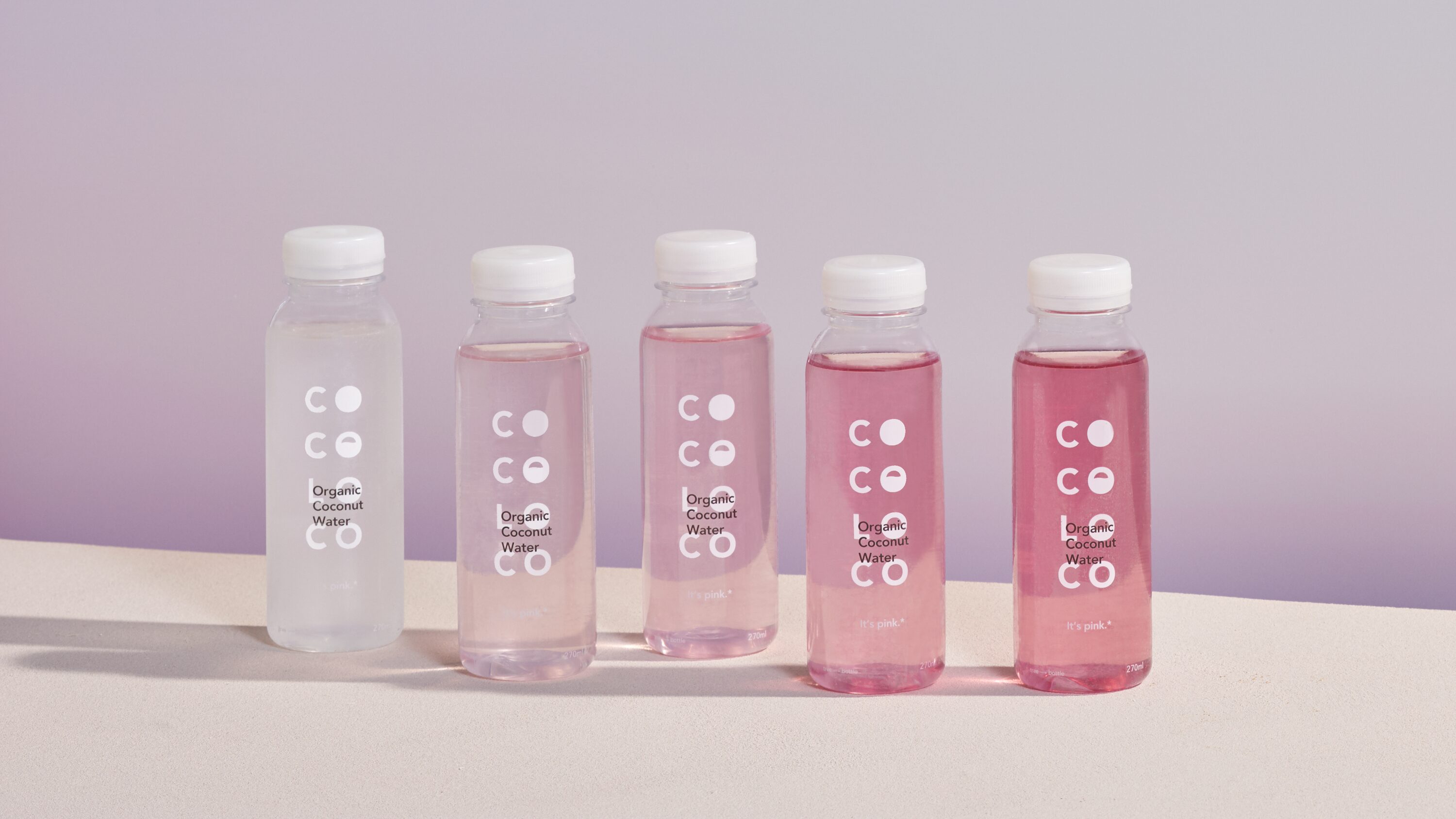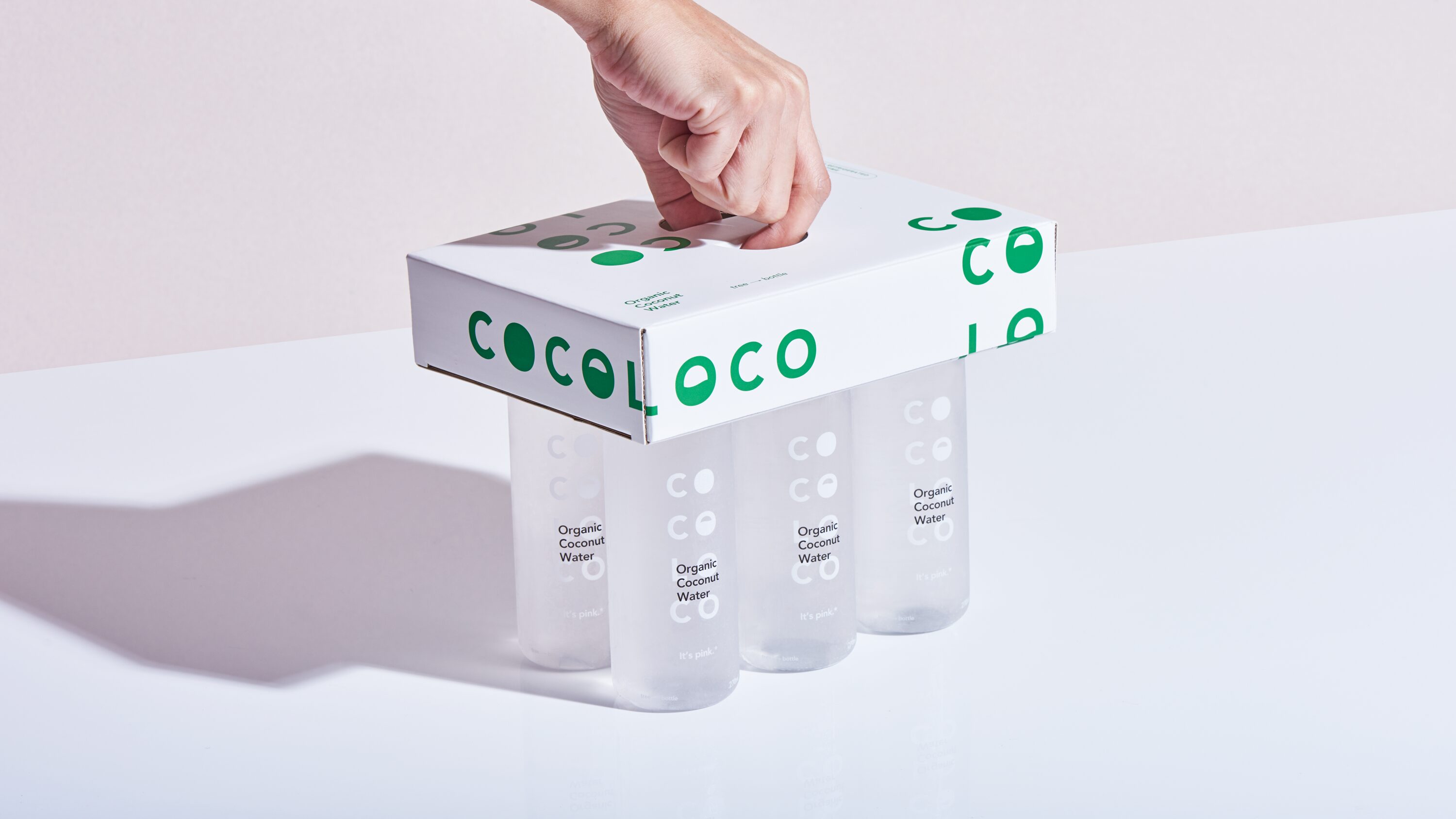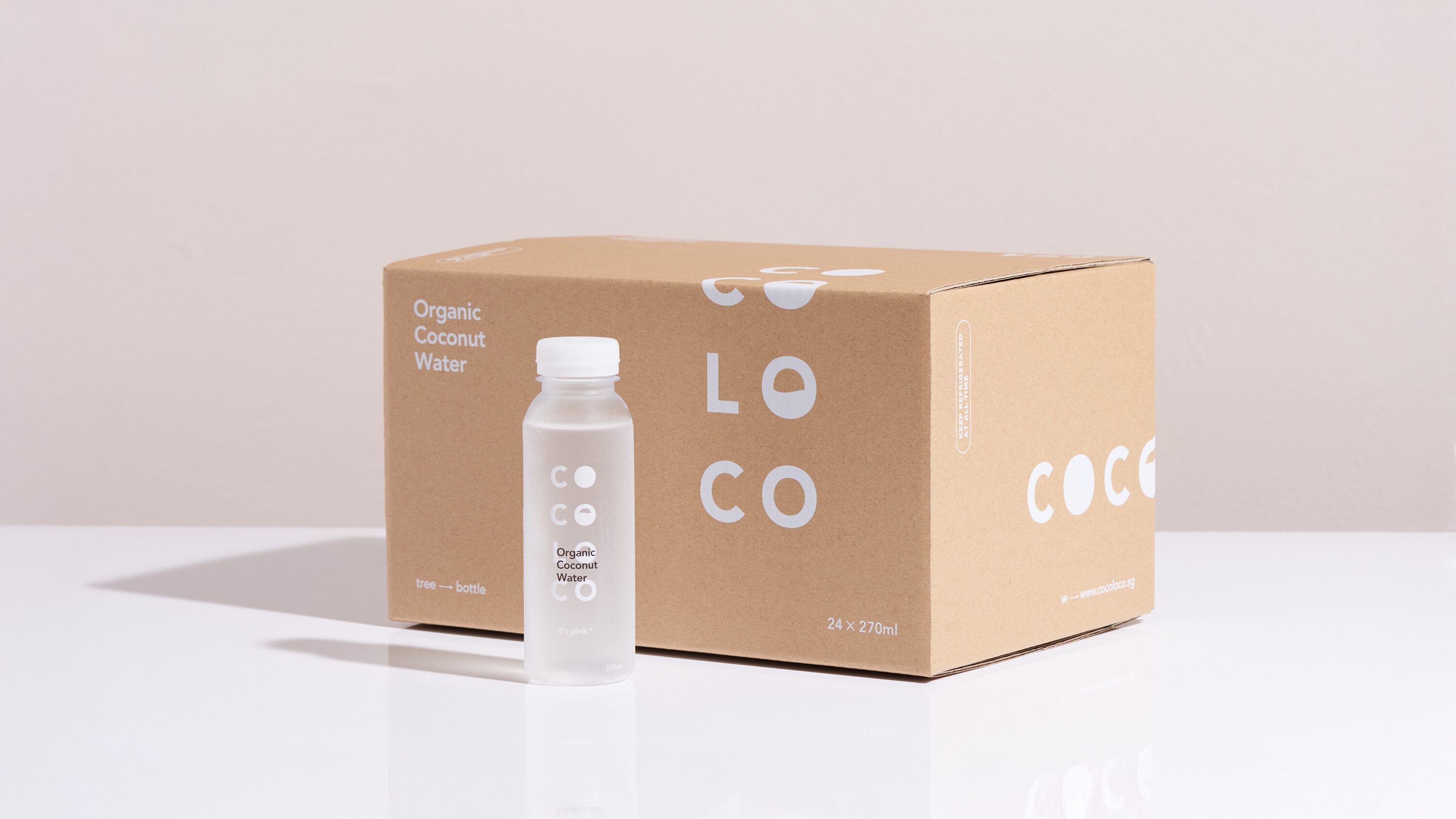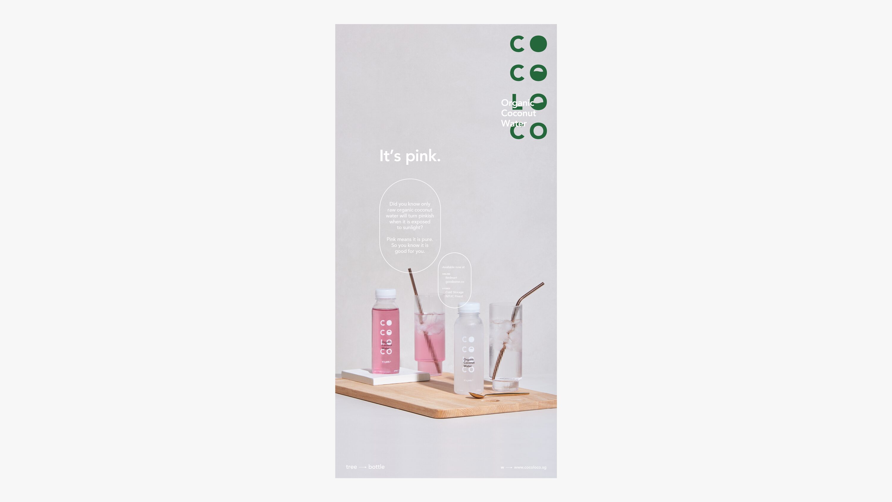
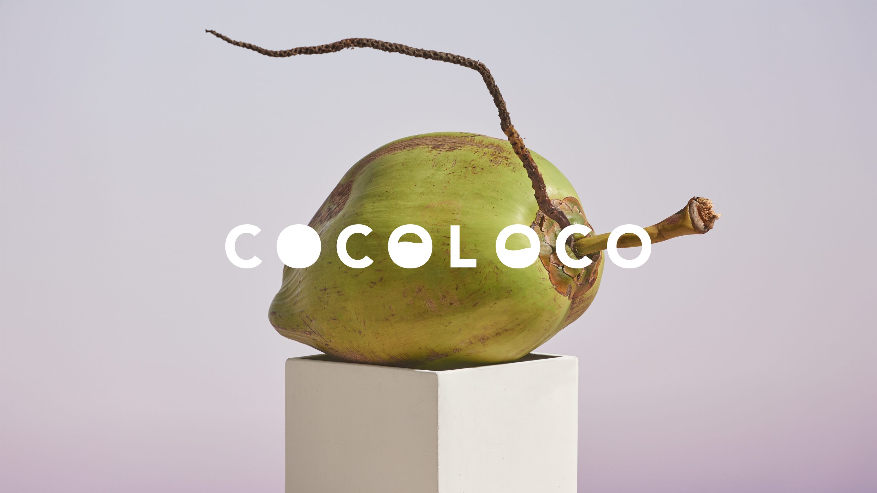
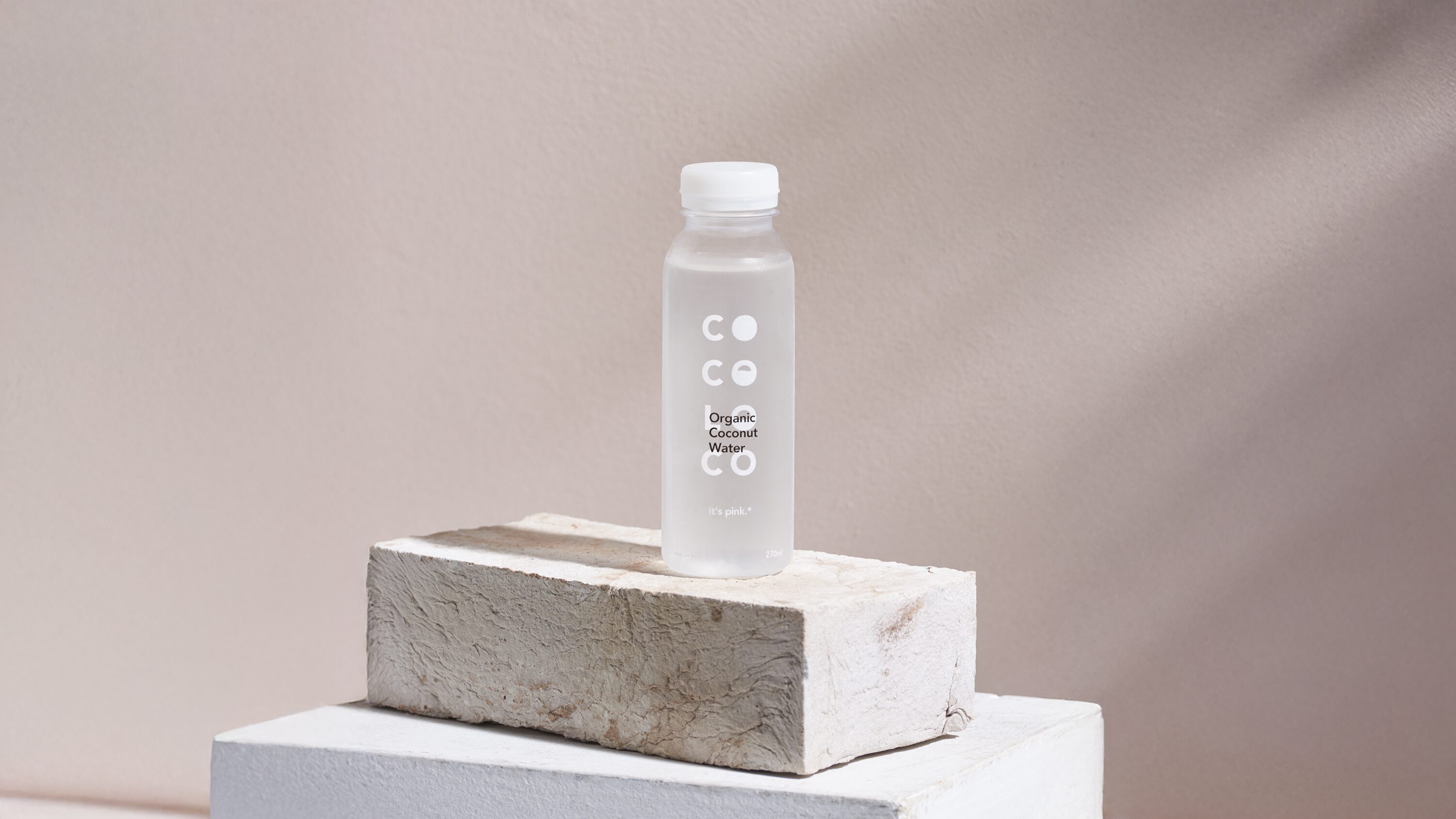
The design adopts a minimalist approach that highlights the product’s inherent qualities, intentionally avoiding visual excess. A transparent bottle is retained as a key packaging feature, allowing the coconut water’s natural pink hue—caused by the presence of natural enzymes in unprocessed coconut water—to be fully visible.
This subtle yet striking transformation becomes central to the brand narrative, reinforcing COCOLOCO’s commitment to authenticity and unprocessed freshness.
